College Unveils New Branding for Athletics, Academics
By Kay King
Editor-in-Chief
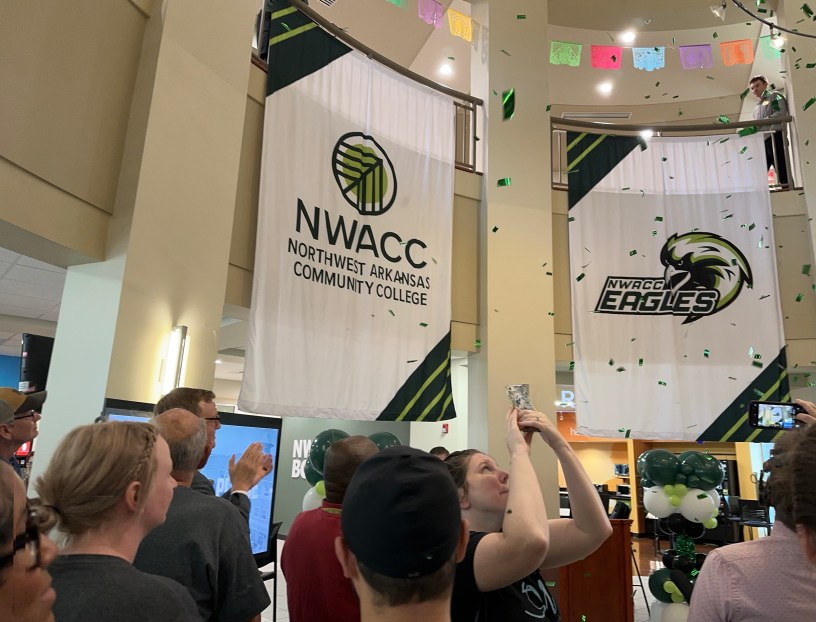
BENTONVILLE — Excitement buzzed in the NWACC student center today (July 11) as students, faculty, and staff waited for the new campus logo to be debuted. After brief remarks and a countdown from 10, confetti was dropped and banners conveying the new look unfurled from the second floor railing of the student center.
The new athletic and academic logos aim to look edgier, relevant and distinctive. “This project was two years in the making,” Dennis Rittle, NWACC president, told the press at the event. “We needed to update the brand for the community and the students agreed … we need a brand to be proud of and represent who we are as a team.” Rittle made opening remarks at the announcement event and praised the work of Grant Hodges, chief of staff and executive director of communications, and Amy Rodriguez, director of marketing and creative services, for their work and leadership in the project.
The main virtues of the college had to remain true for the rebranding, college leaders said. A brief slide presentation that accompanied the remarks described the virtues this way: “NorthWest Arkansas Community College offers a welcoming environment for people with diverse backgrounds — from high school graduates to adult learners — with the shared goal of advancing their future by transferring to a 4-year institution or stepping directly into a fulfilling career. Our exceptional faculty and supportive staff equip students with the essential knowledge and skills needed to excel in their field without incurring significant debt. Committed to serving our community, we develop and enhance programs to meet regional workforce needs.”
Research and feedback were used to make the transition into a new image perfect. There were eight months of reaching out all over the community and getting the public’s opinions of how they thought the NWACC Eagles should be depicted, college leaders said. Focus group discussions were held with specific groups, such as alumni, faculty, staff and trustees. Almost 2,000 online surveys were completed. Much to the pleasure of Dewey Price, the senior director of public relations and marketing at Twenty Fifth Hour Communications, more than 60% of all survey responses were from the students themselves. (Twenty Fifth Hour Communications was the agency leading the rebranding project.) Price described the process of trying to figure out a logo that would stand out from the crowd while also keeping the core values of NWACC intact. “What makes a logo great?” a slide was titled. The answers were Simplicity, Memorability, Versatility and Relevance.
Although some people of the community might think that change isn’t always wanted or needed, rebranding allows the opportunity for colleges to get a refresh. New branding can result in: Attracting and Retaining Students, the ability to Differentiate for the competition, improve digital presence, and acknowledge innovation and forward thinking, the presentation noted.
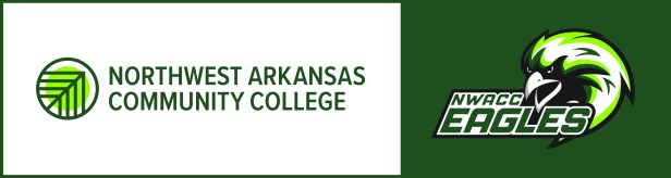
Rittle explained the meaning behind the academic emblem, which contains a circle. “The circle is for unity. The arrows are referencing the tree from the old logo, and also points from bottom left to top right to symbolize always moving forward.”
With the athletic logo, the eagle was carefully thought about. The design team knew they wanted something that looked “edgier” and intimidating. Finally, it was decided that instead of having the Eagle only shown by its side profile like some other mascot emblems, the Eagle had to face forward to look at its prey. The simplistic design and striking gaze make the NWACC Eagle easily identifiable as well as something every fan would be proud to support.
